Top 12 Data Visualization Tips Right From Our Design Kitchen

Introduction
Today visualization is essential – there is too much content, people are simply drowning in it. The visually presented information is more familiar and pleasant to the human eye. Quickly convey any thoughts and ideas.
Thus, the information is perceived better if presented in beautiful diagrams, graphs, animations, etc. This is called data visualization – that’s what we’ll talk about.
Data Visualization Definition
Data visualization is the graphical representation of information and data. By using visual elements like charts, graphs, and maps, animations, infographics, etc. data visualization tools provide incredible visual environment for the items you need to point out from all the rest.
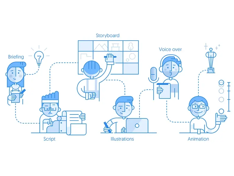
It’s silly to avoid visualizing your data where you can do it automatically and save so many resources while producing materials for your marketing campaigns, commercials, etc. How? – With the help of animated video production company masters. They will also hint at some useful tips for data visualization in no time. Here they are.
12 Best Tips for Data Visualization
How to visualize data in the best possible way? There are at least twelve pieces of advice that our animation chiefs may remind you of.
1. Select the chart that best illustrates the narrative
We learn information about the world entirely unconsciously. Specific visual characteristics (shape, contrast) remain purely on the subcortex, which we can notice and determine right away without looking too closely at the image. But the range of these characteristics is limited – first, our brain reads what it knows, and only then completes a complete picture. Take it into account when illustrating your narrative.
2. Remove everything that isn’t relevant to the story
Behind the graphs in reports and blog articles, people are primarily interested in the story. A graph consists of various data – numbers, dates, names. This does not necessarily mean that you should place all the data on it at once. Do not overload the schemas with unnecessary information – it is better to let it be less, but the data will be verified and understandable.
3. Select the most effective visualization
It is simple to rearrange entire chunks of text or highlight relations and all due to the visualization. It’s also just beautiful, so that some infographics would be a great addition to your news or analytics portal or blog and more. It is easy to explain complex things or phenomena through objects.
4. Tell the entire story
Can you really tell an entire story in data visualization? Sure, you can, and should. Of course, it’s more about how you manage all the visualization elements. Make the story flawless with a great combination or colors, layouts, fonts, messages, callouts altogether. Or at least try to achieve that perfection.
5. Use callouts wisely
Use your wording wisely: callout extensions tend to have low conversion rates. That’s why you need to ensure you use words that match up with what’s being depicted. When you use notifications wisely and cautiously, the users will empathize with what you’re describing in your visuals. Callouts prompt inquiry, further thinking, and close examination of your data.
6. Don’t over-explain
It’s better to avoid visual noise because submerge, dark or heavy grid lines, unnecessary icons and labels, a lot of text, shadows and gradients, provide excessive volume. Don’t over-explain.

7. Incorporate contextual clues with shapes and designs
The so-called slideshow effect is very common, when the scheme is separate, the text is separate. But this is not good – it is necessary that graphics and text complement each other. Therefore, a legend explaining the meaning of a line, column, and point must be placed directly on the chart or at the end of the line.
8. Keep it simple
One of the most familiar types and the simplest ones for data visualization for us are graphs that we see in textbooks at school, the first thing we get to know with them when we start to master Excel.
Graphs show the dependence of the data on each other. They, in turn, are divided into several more subspecies. However, they’re not the limit when you want to keep it simple.
9. Use colors effectively in data visualizations
The best practices here will be using colors to create associations. As with all designs used you’re your communication, good data visualization design should harness common conventions and uses them as shorthand.
Do use a single color. Show continuous data or apply to contrast to show comparison/contrast.
Harmonize colors with wording.
10. Don’t use more than 6 colors in a single layout
Color is one of the most powerful tools in the designer’s toolkit. There are, however, rules that should be broken. Like never using more than three various fonts in email designs, here don’t overuse colors. Pick no more than 5-6 best harmonized with your data.
11. Promote the right way
People perceive and remember visual information better. Looking at pictures and looking for something to relate to which is quite exciting> that means you will increase the time spent on your data, and, consequently, their involvement and loyalty to your company will grow. You drive much more traffic to your website through your visuals.
12. Analyze a large dataset
This is where visualization is most often applies – to make analysis, statistics/reports. For example, to display the company’s annual profit, come to a logical conclusion by looking at a graph where one of the columns is higher. It’s better rather than flipping through several statistics pages in Google Sheets or somewhere in Excel.
Conclusion
So, if you create any interactive or visual story, your storytelling to become truly interactive should be developed taking into consideration the elementary rules described above. All of the animated elements must appear in place and help the user experience the story. That’s what should be the recipe for great design or animation.
Also, don’t forget to read some more on data visualization tips and tricks with us. If you need some inspiration before you actually come up with your brilliant idea, look through professional work samples.
For creating amazing visuals for your business marketing or any other business purpose from scratch, feel free to contact us right away!