Data Visualization Tips: Basic Rules, Tricks, and Tools
Often standard Excel spreadsheets do not reveal the complete picture of your marketing or any other activities. When there is no way to involve analysts in creating more quality reports, incredible services & tools for data visualization come in handy more than ever.

This time, it’s high time to think about why you need to visualize your reports so that to do it correctly, what useful tools to use for interactive dashboards creation without any coding, as well as pick the right helper for your business needs.
Why Visualization Rocks?
There are one million reasons to get visual for your clients and you know that. Nevertheless, here are some well-known psychology facts to consider before starting another useless Excel show:
- 90% of information about the environment is received by a person through eyes.
- 50% of our brain neurons are constantly involved in the processing of visual information.
- The presence of pictures increases the desire to read the text by 80%.
- A person remembers 10% of what he/she heard, 20% of what’s read, and 80% of what’s seen!
- People will perceive 70% of the information if there are no illustrations in the medicine instructions, for example. Add pictures there – the figure will increase up to 95%.
More than enough facts to realize how important data visualization tips are in numerous spheres of human activity, not to mention digital marketing or similar.
How Good Visualization Benefits Your Business?
Good data visualization will bring many benefits to your business in any niche, from non-commercial to e-commerce, marketing, education, medicine & government, etc. All you need is to choose the right tool. But first – let’s check out the real good the visualization brings to either of them.
It boosts decision making
It is easier and faster to draw a particular conclusion by looking at a graph. One of the columns or one of the touchpoints is much higher than all the others there. It’s easier to look them through rather than flip through several statistics pages in plain figures via Google Sheets or Excel, which are pretty specific environments by nature to perceive & process.
It is perceived faster
As it was said above, most people perceive and remember visual information better. They are called visuals and comprise about 80-85% of people living on our planet. It’s a fact: a picture paints a thousand words.
It engages more audience
High reading engagement is one of the critical marketing pains. That’s what this is all about. Beautiful bright graphics with a clear message will attract the attention of your readers once and for all. This also means that you highly optimize your work too.
It immediately explains the data
A better understanding of data by all levels of specialists involved in the process is what we need. Perfect reports are understandable to technicians, designers, analysts or Data Scientists, and the marketing director or CEO and allow each employee to make decisions in their area of responsibility.
Rules for Successful Data Visualization
The first thing to do before creating a graph or video is to check the data for accuracy and correctness. For example, if your conversion rate is somewhere around 300% and the average is usually 50-70%, check where that number came from.
Perhaps it was the total field, and you have summed up all the data, and all went wrong. Or this may be some kind of an outlier that needs to be removed from the visualization; otherwise, this jump will break the whole picture. Due to similar mistakes in the reports, you may come to the wrong conclusions and make the bad decision, as a result.
In our everyday lives, we are used to the fact that the right message needs to be conveyed to the right person at the right time. So, there are three similar rules when visualizing data based on this concept:
- You need to choose the right schedule depending on what your goal is.
- Make sure your schedule’s message is right for your audience.
- Arrange the graph or video in the appropriate design.
If you made a timely message, but the graph does not reflect the dynamics, it has the wrong message or a complex design, and then there will not be the result you’ve expected.
Why Beautiful Design is Important
Always keep it simple when designing your charts, graphs, or explainer videos. If you need to prepare some kind of standard report, you shouldn’t reinvent the wheel or do some beautification with something common and well recognizable.
Avoid unnecessary elements that only clutter up the graph: an abundance of different colors and structures, 3D volume, shadows, gradients, etc.
Believe us, the simpler the visualization, the better the perceived information that you wanted to convey.
Don’t make the visualization too small; don’t overlay all the graphics on one dashboard page. It is considered a bad form to use more than three types of charts in one slide or on one dashboard page at the same time. If you really need so many types of graphs, place them on different pages to make them easier to read.
Simultaneously, feel free to experiment. Sounds controversial? An excellent visualization is always a blend of something familiar and original. The thing is that when you have an atypical problem – the solution may also be atypical. And you visualize your reports – accordingly – somehow original.
Don’t be afraid to try dynamic reports in your practice. By dynamic reports, we mean the ability to load data from various sources on the go, so they change immediately while updated. This is where dynamic visualization comes in handy. To show objects in motion where needed may be the best idea of visualization and making the data look animated & extra visible.
5 Tools to Visualize Your Data
Let’s take a look at five data visualization tips & tools that may come in handy for multiple purposes and see how to choose the one that’s right for your business.
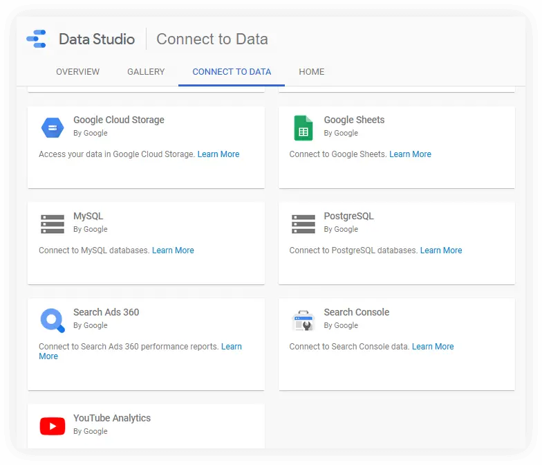
Google Data Studio
Data Studio allows you to connect your sources, visualize data and, most conveniently, easily share reports with colleagues, just like the rest of Google products all-in-one.
Advantages:
- It’s free.
- It has more than 150 connectors, easy to integrate.
- You may use data from multiple sources on one dashboard.
- Convenient to share reports.
- User-friendly interface
- Create any complexity report in few steps
Besides, Google Data Studio has a great gallery with ready-made templates that you can use for your reports.
This is a free tool that has a lot of connectors. Only 17 native ones and all provided by Google. They are tested, work well, and in general, they are sufficient for basic tasks. Besides, there are connectors provided by their partners.
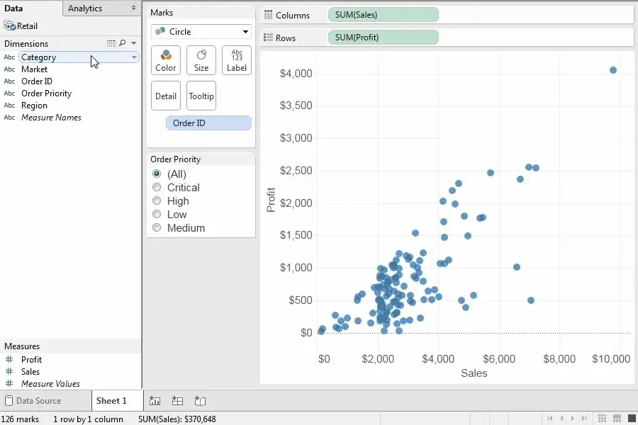
Tableau
Tableau is an interactive analytics system that allows deep and comprehensive analysis of large amounts of information in the shortest possible time and does not require training for business users or expensive implementation.
Advantages:
- Any format data processing (Excel, Oracle, etc.)
- Quick installment
- Ready-made industry solutions available
- Results calculation high speed
- Affordable price
- Great UX
- Create any report in just a few steps
- Data analysis time reduced
- Vast possibilities of data visualization
All levels of reports sophistication – from the simplest to trend analysis and correlation are all available with this tool.
Tableau is based on two innovative technologies: VizQL, which allows you to create complex visualizations with a mouse click, and Data Engine, which provides analysis of millions of data lines within seconds. Tableau is already used by 65,000 users in 100 countries around the world, including employees of Amazon, BP, Apple, Walmart, Heineken, Starbucks, Pfizer, Coca-Cola, Bank of America, and Barclays.
Tangle
For more tech-savvy users, Tangle may be a great tool to prepare beautifully visualized data. It is actually a JavaScript library for creating reactive documents. Your readers may interactively explore its possibilities, play with parameters, and see the document update immediately. Dynamic reports are what it actually makes. Tangle is super simple and easy to learn.
This one is an interesting tool, free of charge, and available online for a try. Here you can learn non-standard types of visualization and, possibly, find a new approach to your data visualization.
Canva
Everyone knows Canva as one of the most favorite online web services for creating beautiful graphic design & presentations. What’s most important is that you do not necessarily have to be a designer to use it to present your creative ideas or build up marketing data visualization, etc.
Instagram creatives, logos, posters, YouTube channel design, blog banners, business cards, ads, presentations – any graphic design object can be done by a beginner when they have a professional sample at their disposal. Online platform Canva invites users to create their designs based on ready-made templates.
You can invite other users to work on graphic design by sending them invitations. The free version also has a built-in commenting feature. Advanced features are available in Pro and Enterprise editions which are paid.
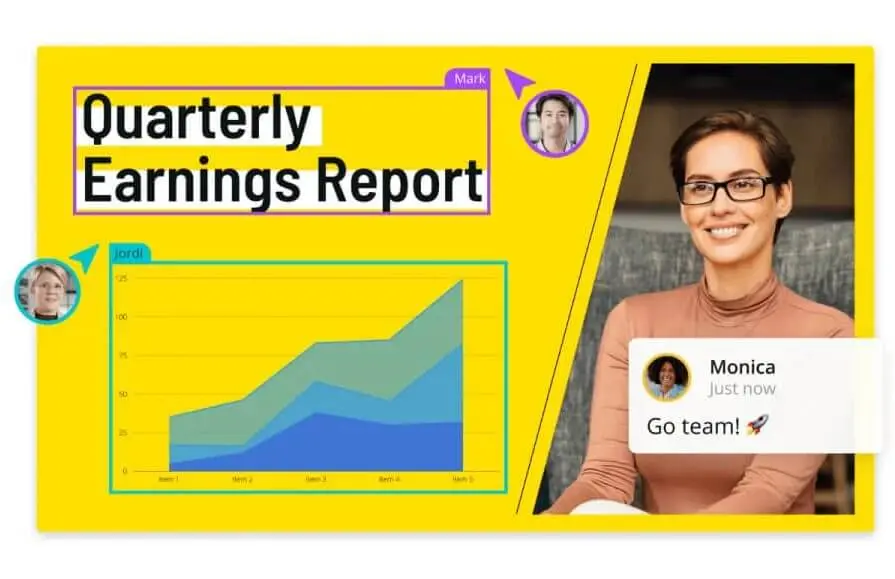
Explain Ninja
Explain Ninja main page view
For those who need amazing explainer videos, this tool will come in handy. Explain Ninja is created to produce a video to help companies better transfer their messages to their users, spice up digital presence, and stand out from competitors, making it a great marketing tool. Suppose you are someone from creative marketing agencies, startups, or enterprises looking for excellent video processing help, considering your vision and business goals. In that case, this is the right place to start.
How to Pick the Right Tool?
What should be the guide when choosing a tool for creating reports for your business?
Start with the tasks that you want to solve. For example, nowadays the main trend in the market is the ability to watch reports in dynamics & explainer videos. If the tool does not know how to work with dynamic reports, don’t choose that. To follow trends you need a trendy tool.
If you’re a bit conservative, then pick the one that is more common and has no sophisticated features.
Consider the budget you are willing to pay for it. If you have a large enough team and each employee must work with a visualization tool, then the cost of a subscription per person may become critical.
To sum up, think about such things as who, where, and why will be using the chosen tool: consider all pros & cons: dynamic or not, free or paid, whether group editing or commenting is possible, etc. How easy is it to get started, is the interface intuitive, etc.? Is it possible to create a report without knowledge of programming? To make it short, make everything possible to pick the tool for your business data visualization that perfectly suits your goals and needs.