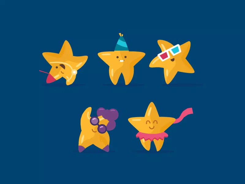
Logo Design Challenges
How to make a digital logo easily having no serious brand content production challenges or mistakes in it is something everyone wants to know. In reality, even when your logo has all the necessary characteristics to match a standard, you still can’t be sure that you did a great job and your logo is a perfect case because there’s always some challenge logo design. Let’s revise some of them.
5 Challenges of Logo Design
Since a logo has to be used by any brand or business owner on small business cards, products, apps, etc., the logo becomes unrecognizable if made wrong. If the main features are not clearly visible in small sizes, then it’s challenging to perceive it. There are too many details in the complex design and many of them are lost in reduced sizes. Apart from this, there may be more challenges to take, however.
Discovering a Unique Idea
An outdated logo style is hard to recognize and detect. Even a very good designer cannot always explain why one graphic is outdated and another is not. When Photoshop or similar first appeared, everyone began to engage in graphic design, using the effects built into the program at random. Back then, these techniques looked fresh and innovative, but now they are outdated, and we perceive them differently. Thus, discovering and achieving new digital design logo styles become more and more challenging. Each design idea may become a challenge. Not to mention making it really not to look out of date like everyone else.
Working with Clients
In a client-designer relationship, both of them need to feel supported and know that their ideas matter which is the most controversial and challenging thing. Mutual respect for each other’s viewpoints, clients, and visual creators’ open lines of communication make for a sense of mutual well-being. Psychological safety means that neither of them leads to your emotions. And this may impact logo design results.
Time Management
Understanding the amount of time that it takes for them to get something done with animation logo design and when they need to get it done allows all the participants of the process to assess their effort and how they work a million times better. Animation design is creative and it’s a challenge to fit into the deadline very often. But once you understand your workflow, the work you typically do in 3 hours can be done in 1 hour, roughly speaking.
Keeping Up with Trends
Sometimes following the trends is good, sometimes, not. A complex or sophisticated design and a large number of details can make the logo difficult to perceive, moreover, such details are difficult to see at small logo sizes and they are oven lost. It’s like looking at fingerprints from a distance – you won’t see a clear pattern, just a smudge. Or maybe there will be another issue found that challenges the logo and makes it weird. Besides, trends are often changeable and there’s no need of keeping up with it. Instead, it’s better to stick to a classy timeless style.
Upgrading Skill
There are many tips on how to create featured logos for everyone. However, upgrading skills may take time and effort even for a professional creator. Logo design elements that are not connected by a common idea and do not reflect the essence of the company’s activities and positioning are meaningless sets of letters and pictures that do not carry any information. That’s why upgrading skills ensure profound work with website logo design. Creating a logo is like creating a business card, only for a company, not for a single person and that demands professionalism.
How Logo Design Has Changed
Modern logo design dates back to the early Renaissance, to the 13th century. Freemasons, paper makers, and potters were some of the first professions where people used pressed signs, chiseled symbols, watermarks on paper, and simple inscriptions as unique designs.
Today, there are many corporations, products, brands, services, agencies, and other organizations that use an ideogram (writing mark) or an emblem (symbol), or a combination of mark and emblem as a logo.
Just like brand products, over time, logo design can start to drag behind the major technology trends. Therefore, companies from time to time need to take risks, step and transform a logo design to make it recognizable by consumers over and over again with the flaw of time.
It’s not necessarily expensive, something that will visually reflect the modern current brand development strategy. As a result, the company may expect either even greater audience loyalty, large successful advertising campaigns, and, as a result, sales growth, or criticism and big losses, if they create a logo animation of low quality or meaningless design, etc.
As a result, a number of logos that have undergone major changes over the years allow us to trace not only the history of brand development but also the evolution in the field of logo design development. Of course, the original images used to create the logo often become a natural consequence of quite interesting events like rebranding, awards, contests, etc., in the life of the company or something more.
Qualities of an Effective Digital Logo
There are about ten qualities of the most effective digital logo design that one needs in order to achieve great results in business. Apart from the animated logo design ideas for your inspiration, find the fundamental demands:
1) Simplicity
Ease of perception and simplicity of design are one of the postulates. Here you should stick to this golden rule of minimalistic design to avoid confusing users.
2) Style
Of course, the best design concepts are simple, styled and classy. They are timeless and represent the meaning this way.
3) Recognizability
In addition, designs should contain a feature that will be recognisable to the viewers and widely associated with the particular brand.
4) Attractiveness
Again, an attractive logo design is one that is minimalistic in nature. That is to say, you may communicate your message through it in the simplest way possible to avoid misconceptions.
5) Communication
Displaying the image and mission of the company will be a key in creating great logo designs taking into consideration the abovementioned qualities.
6) Legibility
Legibility is the lowest-level consideration in content usability: it’s whether people are able to see, distinguish, and recognize the characters and words in your text. Legibility is thus mainly determined by visual design, specifically typography.
7) Readability
Readability is the arrangement of fonts and words so that it allows make written content flow in a simple, easy to read manner. Legibility refers to how easily distinguishable the letters in a typesetting or font are from one another.
8) Memorability
Memorability is a measure of how easily users remember how to use a website or a brand product if we speak about the logos.
9) Descriptiveness
A descriptive logo is a logo that includes textual or visual design elements (or a combination of the two) that clearly communicate the type of product or service a brand is marketing.
10) Brightness
The most common type of logo design challenge is contrast color or similar used in varying shades of your logo’s color palette to achieve ultimate brightness.
Conclusion
Digital design logo company like Explain Ninja will help you develop a unique professional logo portfolio that is bright, eye-catching, ideological and memorable for any time! We pay special attention to the selection and combination of the main elements of the logo: drawings, illustrations, animations, fonts for the logo, and other elements that make the logo perfect. If you want take design a logo challenge for your company’s logo to be truly professional and of the highest quality, you are welcome to build your business taking any challenge with us.