What is Flat Design and Why do We Need It?
Most likely, you’ve come across attractive websites with minimal elements and bright accents. Moreover, these sites were as user-friendly as possible, and you enjoyed them. 2D images, minimalistic icons, and high-quality animation are all flat designs. This article will tell you what it is, how it differs from Material design, and how to use it to satisfy your customer quickly. Bonus: find out how web flat design 2.0 came about.
A Brief History of Flat Design
The history of flat design has several key moments. Let’s briefly review them:
1950s-1960s
Like most of the styles that are popular today, flat design has moved to digital from the real world. It appeared under the influence of the Swiss style, whose literal slogan is “Form comes after function.” The main characteristics of this style are practicality, efficiency, and functionality. It was embodied in advertising banners, posters, etc.
2006
For the first time, Microsoft used a flat design called Metro. It was used in the Zune MP3 player. The device failed as this player could not compete with the iPod. The Zune had a modern interface design with large sans-serif font.
In parallel to these events, Apple developed its products with Skeuomorphic designs. This is a design in which natural objects from the physical space are transferred as elements to the digital world. The skeuomorphic design emerged not as a trend but as a necessity. The design that imitated natural objects in physical space was as close and understandable to the user as possible.
2010-2013
In addition to the apparent advantages of skeuomorphism, it also had significant disadvantages. For example, pages with many detailed elements took too long to load (statistics show that users leave a page if it takes longer than three seconds to load). In addition, the technical side also suffered because the more details you have, the more complicated and longer it takes to develop them.
After the failure of the player, Microsoft still kept trying to implement a flat design. Therefore, in 2012, they released Windows 8: flat graphic design, sans-serif fonts, and an emphasis on content. Microsoft called the new style “authentically digital,” but critics found many flaws in Fthis version. The overly simplistic design confuses users about how to use system elements if they are similar to pictures and logos.
2014 to the present day
Under the influence of criticism, flat design has gradually changed and evolved into Flat 2.0 design, which has all the advantages of flat website design. Still, now there are no problems with navigation.
Speaking of flat design, material design is based to some extent on a combination of flat graphic design style and skeuomorphism. Google introduced material design as a system of principles (sometimes called a design language) for the Android operating system.
If you put an example of material and flat designs side by side, you won’t immediately notice the difference, but it is there, and we’ll tell you what it is.
Material Design vs. Flat Design
The first thing to understand is that flat design is a design trend, while material Design is an approach developed by Google.
What do they have in common?
- The common feature is simplicity and no realism. You won’t find detailed elements here, only metaphorical images.
- Clarity is another common feature that unites flat and material. Both have plenty of “air” in the graphic.
- Focus on usability. These designs were created to make the user’s journey more effortless. And they succeed thanks to a clear hierarchy and explanatory animations.
What is different?
- The material design allows more use of animation, shadows, and layering.
- You customize the principles of flat design and have more space for imagination. In contrast, the material design follows Google’s recommendations and requirements (which are constantly updated).
- Material design usually takes more time to implement due to the more significant number of animations and elements. The same applies to the speed of page loading by the user.
To summarize, material and flat design have no critical differences. However, Google’s material design is more systematized, transformed into specific requirements, and contains a certain amount of skeuomorphism.
Flat Design Characteristics
Like all other styles, flat design has certain positive and negative aspects. Their expression depends on how well you use the principles of flat design, which we will discuss below. So, the most common characteristics are as follows:
Pros:
- Focus on content
- High level of usability
- Less expensive compared to Skeuomorphic design
- Adaptability to any device (thanks to vector graphics)
- Saving user’s time
- Emphasis on your idea and content. Nothing distracts the user from the project.
Cons:
- Limited space for expression, as it is not recommended to use too many animations, colors, and textures
- High competition among projects, as the style is gaining popularity
- There is a risk of creating a too-simple design that does not stand out among the more colorful solutions
However, the above is just a convention, as a well-done design always has more advantages than disadvantages.
Benefits of Flat design
Now, let’s take a deeper look at the benefits of flat design and how you can use them to save time and money and improve your customer experience.
More attention to the development
You spend less time on detailing elements and can spend more time on improving usability. It’s no secret that users ultimately choose convenience over a pretty picture. Flat design is developed and evaluated by how well it works rather than by how it looks.
Loading speed
This also applies to usability because the first ten seconds of a user’s stay on a website critically determine whether they will stay longer. If your page loads quickly (and the simpler the elements on it, the faster it will be), the more time you have to get the user interested.
Speed and lower cost of implementation
Designing simple elements takes less time than implementing a skeuomorphic design. In addition, the cost of such a design is also lower, and with the correct implementation principles (which we will discuss later), the benefits are higher than with other techniques.
Adaptability
Thanks to vector images, it is much easier to properly organize the adaptability of your digital product. A Flat design is ideal for any device and browser. Therefore, you can easily create responsive designs without losing content quality.
Focus on the idea
Usually, a digital product emerges to carry a particular idea: to share experiences, distribute products that can help others, and offer services. The desire to create a “unique resource” often distracts attention from the main thing — the idea that lies at the heart of your business. The flat design allows you to create products that promote your concept rather than distract from it with their detailed design.
How to Create a Flat Design
When we talk about creating a high-quality flat design, we mean version 2.0, which is more functional and improved. Its creation relies on several essential principles:
When creating a mockup, build an intuitive web hierarchy
With less time spent on design elements, you can focus on the user experience. Build a clear hierarchy of elements based on the user map. Alternatively, you can use the Z-axis (place the parts you want the reader to see first at the top of the Z and the “call to action” at the end).
In flat design, you can use elements of… skeuomorphism?
Unexpectedly, considering these two opposite design styles, it is true.
For Flat 2.0, such elements are considered the norm. The main thing is to use them as usability improvements, not design elements.
For example, flat design illustrator can use shadows to suggest which elements are interactive and speed up user actions, or layering to create the effect of multidimensionality inherent in the digital universe.
Turn to animation
It gives the user more context and makes your design more understandable. In addition, a high-quality explanatory animation increases the site’s ranking in search engines.
You can use animated CTA elements or insert sizeable animated stuff on the front page that conveys the essence of your product. Ultimately, it’s not forbidden at all, as long as you keep it minimalistic and restrained. Remember the functionality of these elements. They should help users, not distract them.
Minimum of fonts
This principle has existed since the digital flat illustration style was a marketing Swiss army knife. Try to use different sizes and strokes instead of changing the font. When choosing a font, you should ensure that the colors are bright and create a sharp contrast with the background. It’s also important to remember the user’s physical context — choose a font that will be readable on a sunny day and on a small screen.
Monochrome base and bright colors for CTA elements
Since fllat design strives for a minimum number of design solutions, you need to highlight essential elements with the help of colors. Keeping the same style for certain parts is vital: simple icons and a clean menu. Also, remember the footer — the elements in it should also be arranged according to a clear and understandable structure.
Content worthy of a flat design
We’ve already emphasized that functional design gives you more space to express your ideas. So don’t waste this chance — develop a universal selling proposition guaranteed to interest the reader. A helpful product + satisfaction from high-quality usability = a happy customer and positive feedback.
Flat Design Examples
To consolidate the material we have covered, we offer a few examples of the flat design below. They differ from each other and can be combined with different styles, but they are based on the principles of flat design.
Home Chores App by Sara Salehi
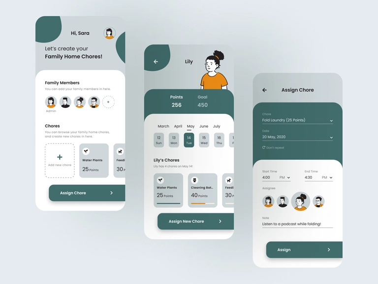
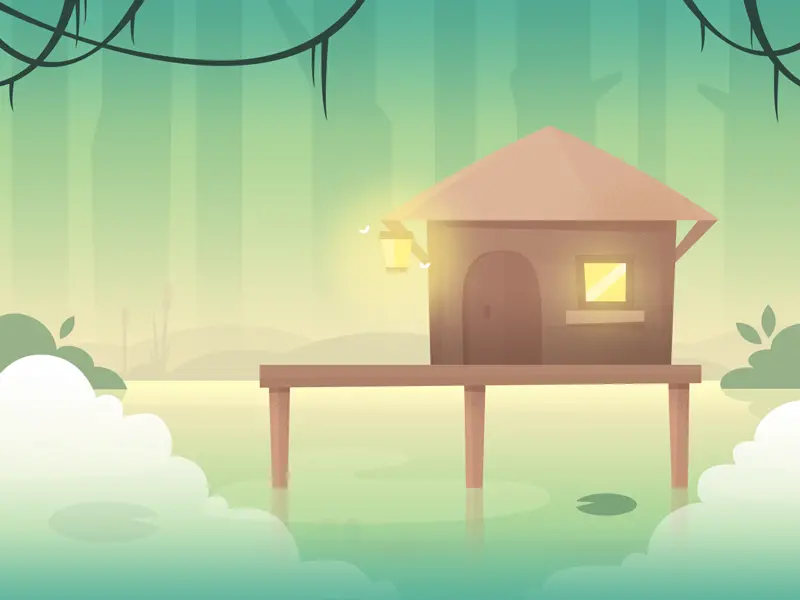
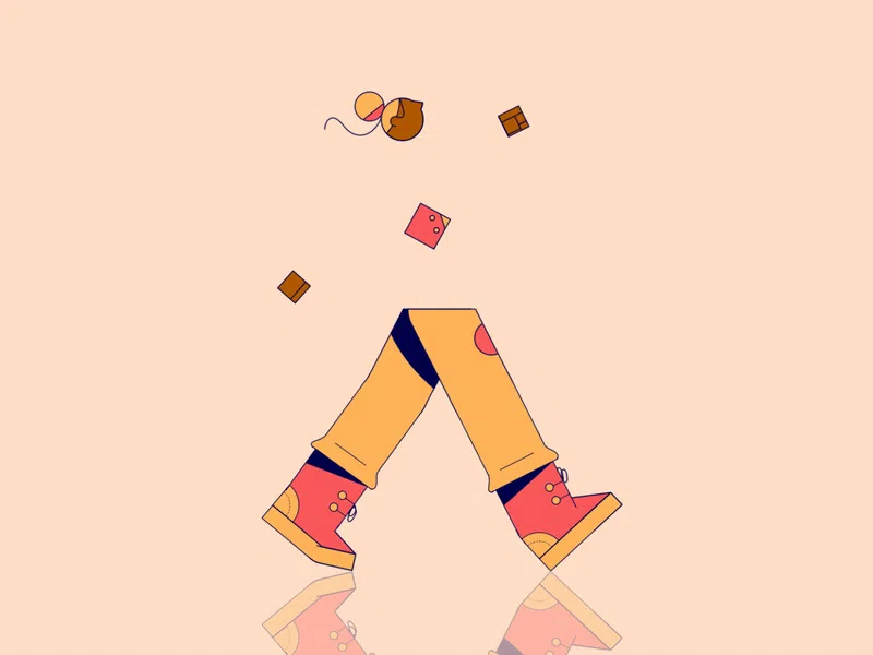
This design combines the principle of monochrome colors with an accent (a girl in a yellow T-shirt). You can see “what does it mean to be flat” and still bright. All illustrations are in 2D style, and possible actions are highlighted.
Also, pay attention to the shadows under some elements, which indicates version 2.0 of the Flat design.
We Do Agency by Rajan Raj
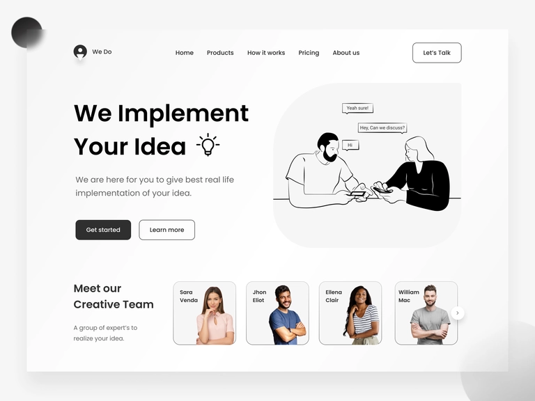
You can see the arrangement of elements along the Z-axis and the non-standard emphasis on CTA elements — transparency and color are contrasted.
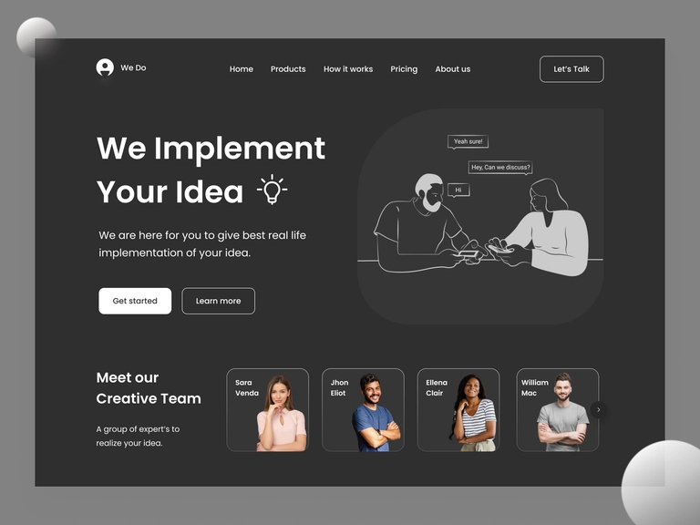
It is also essential that the dark mode does not require additional costs, as it would be in the skeuomorphic style. If you were to detail your elements in a light theme (as required by skeuomorphism), you would have to detail them in the same way for a dark theme, which means additional costs and time.
Deepcrawl by Explain Ninja
Remember the 10-second rule we mentioned above? High-quality animation is one of the most effective ways to engage users and demonstrate your value.
Explain Ninja used several principles of flat design: 2D illustrations, sans serif font, and a focus on functionality. The video primarily explains the value of the project to the user, and it also looks attractive and lightweight.
Book Store by Afterglow
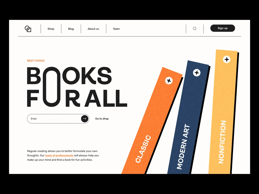
Notice how usability (division into sections, directions with arrows and text) is combined with bright accents. This page loads almost instantly, and the user immediately sees a unique sales offer.
Oxzone Web Platform by Manoj Dalvadi
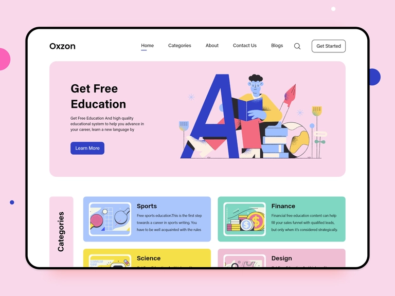
A lot of free space and a clear hierarchy are taken from Flat 2.0, but accents are added as bright illustrations. The designer also used the same font but a different layout. Thus, the design is as light as possible but informative.
Conclusion: Why We Need Flat Design?
Flat graphics has a special place among designs, as it began the shift from the era of skeuomorphism to minimalism. It is an opportunity to create simple, user-friendly designs without losing the quality of the content. Like other trends, Flat design has changed: it was based on the Swiss style of the 1950s, then went through a period of growth and criticism. As a result, flat design 2.0 was born — adaptive and exciting. Flat designs focus on functionality, but that doesn’t mean they’re boring. On the contrary, if you use flat graphics and animations wisely, you’ll get the desired 5-star product.
If you are interested in this style and want to try it in your project, we will be happy to create such an essential part of flat design as high-quality animation for you. We have done it successfully for startups, apps, and software, and the ratings of products with such videos are always on top.