Explaining CSS Animation
Do you know that the basic animation types css (fades, translations, and rotations) can typically be accomplished with CSS animations with a lot less effort? An extremely powerful API for these animations is CSS transitions. Let’s find out how such css animation types may improve your animation project design. Discover the definition of CSS animation, its several subtypes, and examples of how animations are applied to actual website page designs.
What is CSS animation?
Animation is an awasome process of creating the illusion of moving images using successive and rapidly changing still frames. Both experienced animators and novice animation lovers will find it interesting to master the various styles and techniques of it. So, what is css animation?
In the early 2000s, Flash technology was responsible for animation. It was demanding on computer resources like websites with a flash loaded for a very long time.
Flash was replaced by JavaScript animation, or JS, a language that helped make websites interactive without requiring large resources. Today, animation of web resources is done mainly in CSS (Cascading Style Sheets).
A proposed Cascading Style Sheets module called CSS animations enables the CSS-based animation of HTML page elements. For complex animations, it is advised to use JS, but often CSS can do without the help of JavaScript.
HTML creates the structure of the page, and CSS creates its appearance. For CSS styles to work, you need to combine them with the HTML document in which your web page is written.
Since CSS animations are used to allow you to animate the transitions from one CSS style configuration to another, CSS animations consist of two components: a style definition for the animation and a set of keyframes defining the start, end, and possibly intermediate state of the animated styles.
Using keyframes, the CSS Animations module enables you to animate the changing CSS property values. You may adjust clear animations’ time, operation, duration, and quantity to customize their behavior.
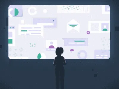
In web design, animations have two crucial roles: they make the site more alive and memorable, and it immerses the user more deeply into the interaction. It can draw attention to a certain block, suggest an action, encourages it, and generally increase the time the user interacts with the website. In addition, sites with animation look more functional, attractive and engaging.
Types of CSS Animation
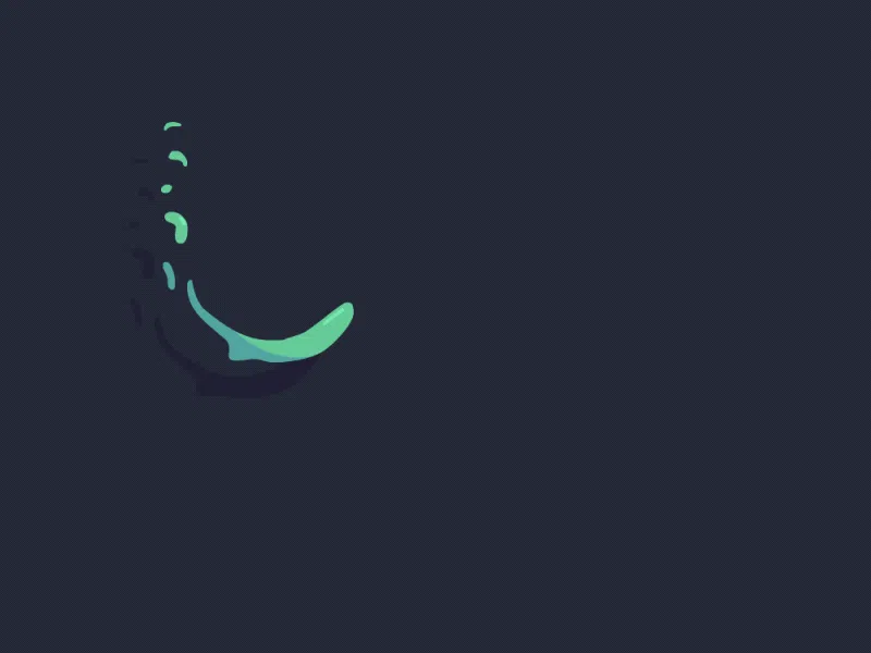
CSS Text Animation
Text animation is a method used to give letters, words, sentences, and occasionally entire paragraphs flair and movement. It is an original idea with countless applications. The animated text css can be made to move up and down, side to side, disappear from view, or follow a predetermined path.
Your visitors’ attention can be immediately captured with animated typography. The most popular CSS text animation techniques include adding a rainbow effect, shadow, glitch, and gooey effects.
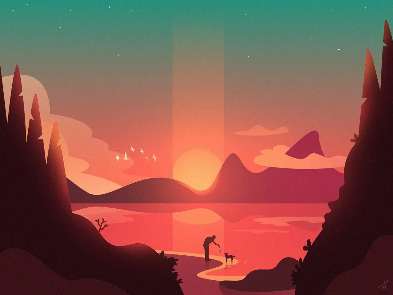
The visitor can observe the text being written on the page in the logo animation shown below, etc.

CSS Color Animation
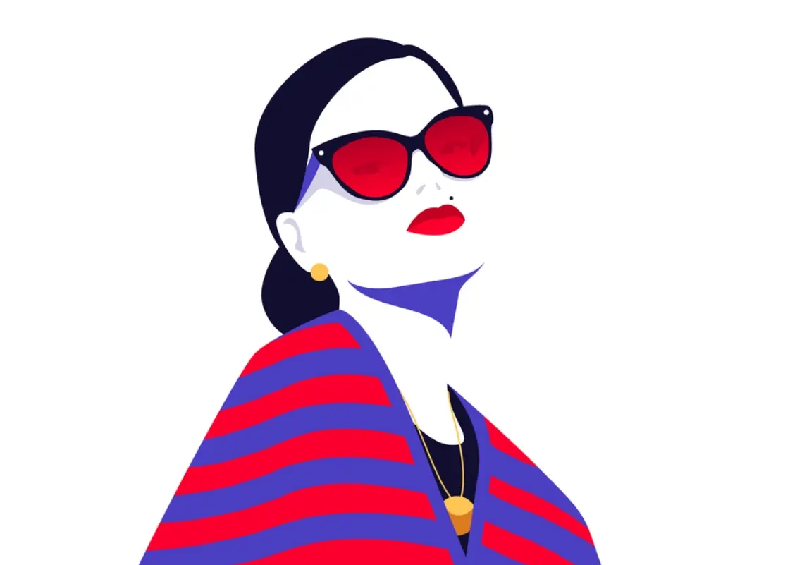
The ability to apply CSS color animations to text, buttons, borders, and other page elements makes them perfect for directing visitors’ attention to a particular area of the website. A web page’s backdrop will frequently be animated to change colors, as in the image below with the additionally added typography.
Slide-in Animation
Similar to transitions, css slide animation is applied to specific elements on a single slide, such as a title, chart, image, or single bullet point. A presentation can become more engaging and memorable by using animations.
To catch the visitor’s attention, you can use this CSS animation to have an element glide in from the top, bottom, left, or right of the screen. You may also incorporate various effects with the slide-in motion to further hone your design.
CSS Rotate Animation
To alter an object’s appearance and behavior over a predetermined period of time, rotate animation is utilized. Thanks to the Rotate motion, our applications will have a better look and feel. In 2D or 3D space, you can rotate an element using CSS. This animation is frequently used in conjunction with other animations to depict moving objects.
Wave CSS Animation
One such application of the rotate animation is in the CSS Wave animation. You need to make numerous HTML elements to represent your waves in order to build a CSS wave animation. The rotate animation will then be applied to each wave with unique backdrop hues and animation-timing property values. You can play about with opacity as well.
CSS Glow Animation
The element-shadow property can be used to produce the CSS glowing text or other object. You can give it a variety of shadows by using this property. Moreover, you can use the box-shadow property in conjunction with some animations to place your text inside an element, then apply the shadow effect to it, etc.
CSS Bounce Animation
Often, for a more impressive entrance, you want it to bounce in. The CSS bounce animation can be used in that situation. To make the element’s bounce appear more realistic, coding these animation needs that a few animation sub properties, such as the time and delay function, be set up. While loading pages, this motion is very prevalent. Here it’s also used as one of the elements.
CSS Fade-in Animation
By ramping the object’s opacity from 0% to 100% at the beginning and then back to 0% at the conclusion, the Fade In/Fade Out feature enables you to seamlessly enter and exit any object.
CSS Hover Animation
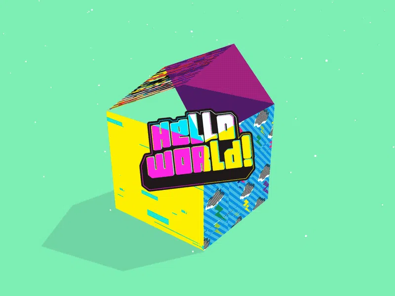
You can make a CSS hover animation to increase your site’s usability. When a user for example hovers their cursor over a website element, this kind of animation appears. On hover, items can be made to zoom, flip, rotate, or even cease playing. The CTA button in the example below enlarges and sparks as the visitor hovers over it.
Infinite Loading Animation
One of several website loading animations you can create using CSS to help users feel less impatient is the infinite loading animation. When the load time is uncertain, this style of animation works perfectly because it informs visitors that the site is loading without letting them know how long they will need to wait.
How long the animation lasts directly affects its speed. Animation should not be too fast or slow: in the first case, the user may not catch it, and in the second, it may feel like the site is slowing down. Therefore, it is better to strike a balance. For example, a noticeable change in color and transparency is easily perceived and can therefore be done more quickly. The speed of animations also depends on their role:
- extra animations (appearance of tooltips, change of the color of the pressed button) are usually faster;
- complex CSS animations (prompting to action, involving the user in interaction) should attract more attention, so they are slower.
It is important to consider that.
Parallax Scrolling
Parallax scrolling is a visual effect that replicates depth by making the foreground and background items on a Web page scroll at different speeds. This gives the appearance of depth or a “faux-3D effect,” which is meant to make browsing on your website more engaging for your visitors.
How To Create Animations with CSS?
CSS animations allow you to animate various transitions from one CSS style configuration to another.CSS animations consist of two components: a style description of the animation and a set of keyframes that define the start, end, and possibly intermediate state of the style being animated.
Animation allows an element to gradually transition from one style to another.
You can change any number of CSS properties as many times as you like.
To use CSS animation, you must first specify some keyframes for the animation.
Keyframes hold what styles an element will have at a particular time.
How to make an animation in css? Technically, to create a CSS animation, you must style your animated elements with the animation property or its sub-properties. This will allow you to adjust the animation’s acceleration and duration and other details of how the animation should flow. To customize the look of the animation, you apply @keyframes in sequencing animation with keyframes.
The @keyframes at-rule is used to specify keyframes. Examining this at-syntax rule’s will help.
The following is how the at-rule @keyframes is written:
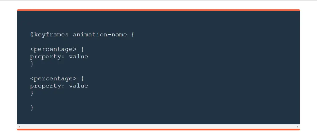
Source: HubSpot
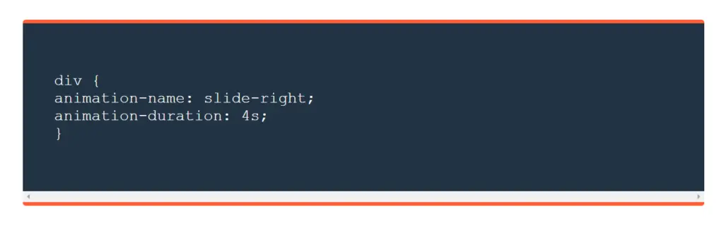
The @keyframes rule allows you to create animation using a set of keyframes, that is, it describes the state of an object at a certain point in time. Let’s look at a simple example.
When you add any property, for example slide-right, the animated element is a div, with the animation name “slide-right” and a four-second animation cycle. The animated div’s CSS is provided here:
There are 9 properties that allow you to control CSS animations:
- animation-name;
- animation-duration;
- animation-timing-function;
- animation-delay;
- animation-iteration-count;
- animation-direction;
- animation-play-state;
- animation-fill-mode;
- animation;
animation-name – This is the name of the animation that associates the @keyframes rule with the selector.
Example:
animation-name: my-animation;
@keyframes my-animation {
0% { opacity: 0; }
100% { opacity: 1; }
}
animation-iteration-count – sets the number of repetitions of the animation, the default value is 1. The infinite value means that the animation will play indefinitely.
Example:
animation-iteration-count: 2;
animation-direction – sets the animation direction.
Example:
animation-direction: reverse;
animation-play-state – This property controls how the animation stops and plays. There are two values, running (the animation plays, default) and paused (stops the animation).
Example:
animation-play-state: paused;
animation-fill-mode – sets which CSS properties will be applied to the object before or after the animation. It can take the following values:
none — animated CSS properties will be applied to the object only during animation playback, after the end the object returns to its original state;
forwards – animated CSS properties will be applied to the object after the animation has finished playing;
backwards – animated CSS properties will be applied to the object before the animation starts playing;
both – animated CSS properties will be applied to the object both before and after the animation playback ends;
Example:
animation-fill-mode: backwards;
The animation-duration , animation-timing-function , animation-delay properties work the same as the CSS transitions properties.
The animation-duration property determines how long the animation should take to complete. If the animation-duration property is not set, the animation will not run because the default value is 0 seconds.
For example, when the style would change using the “from” and “to” keywords (which represents 0% (Start) and 100% (full)).
You can also use a percentage. You can add any number of style changes using a percentage.
The following example changes the background color of a <div> element when the animation ends at 25%, ends at 50%, and finishes again at 100%, etc.
With animations CSS, you can create quite complex animations without the use of JavaScript. A vivid example is loaders, that is, elements that show that something is loading on your page and others.
For more on CSS, also read here.
Earlier making high-quality and beautiful animation was quite a task because CSS couldn’t do that, so all the animations were done in JavaScript. It was necessary to spend a lot of time learning coding and developing, and the end result in design could be quite disappointing.
Now it’s easy and fast to create animation css. Besides, there are three advantages of CSS animation over traditional methods:
The ease of use for simple animations is provided; you can create animation without knowing JavaScript.
Animations will work well even under moderate system loads. Simple JavaScript library animations, if poorly written, may often perform poorly. The engine can use frame-skipping and other techniques to keep performance at such a high level.
It allows the browser to control the animation sequence, thereby optimizing browser performance and efficiency. For example, by reducing the refresh rate of animation frames in currently unviewed tabs, etc.
The loading animation on the website is quite simple to create. First, you need to create an HTML animation structure and place it after the opening <body> tag. And the animation itself can be done:
- on pure CSS;
- using an animated GIF;
- with an animated SVG image.
CSS animations allow for more complex animations than CSS transitions.
CSS Animation Examples
On some websites, you are welcomed with beautiful pop-up menus and buttons that change appearance when you hover over, click, or scroll the page. Such effects are made with animation – they affect the overall impression of the resource and the site’s ease of use.
The smoother the transitions and the more unusual the animation, the more wow effect your site will have on the visitor. CSS helps to achieve smoothness and other animation properties. So, if you want to look through more awesome css animation examples, or add one to your project, feel free to visit our Dribble page or contact the team for more cases.
Conclusion
CSS animations allow you to animate transitions from one CSS style configuration to another and create excellent animated elements for your video, website, or other digital products, software etc. CSS animations consist of two components: a style definition for the animation and a set of keyframes that define the start, end, and possibly intermediate state of the animated styles and are easy to apply, unlike JS codes and other technologies used for animated design before. If you want to css animate and need help from experienced designers to create video for a product contact us in no time.