Design Antitrends You’d Better Avoid
The visual appeal of your digital product plays an important role for the average user. Like the fashion trends that are discovered every year, dealing with the appearance of websites and applications, is also a trend. However, there are also anti-designs you’d better avoid using for your brand. Let’s revise some of them.

Anti Design Trends for 2022
The modern design of websites and mobile applications has a huge variety. Today, you will not surprise anyone with a pop-up animation. A couple of years ago it was a cool and stylish trend, but now it can be found on the Internet everywhere.
At the same time, professional UI designers regularly set the mood and come up with new unusual features. Be it graphic, motion design or animations, UI/UX for websites or apps, there are features that are still better to leave behind as they are not just outdated but may affect your digital product UX/UI efficiency. So here are some of them.
Flat illustrations
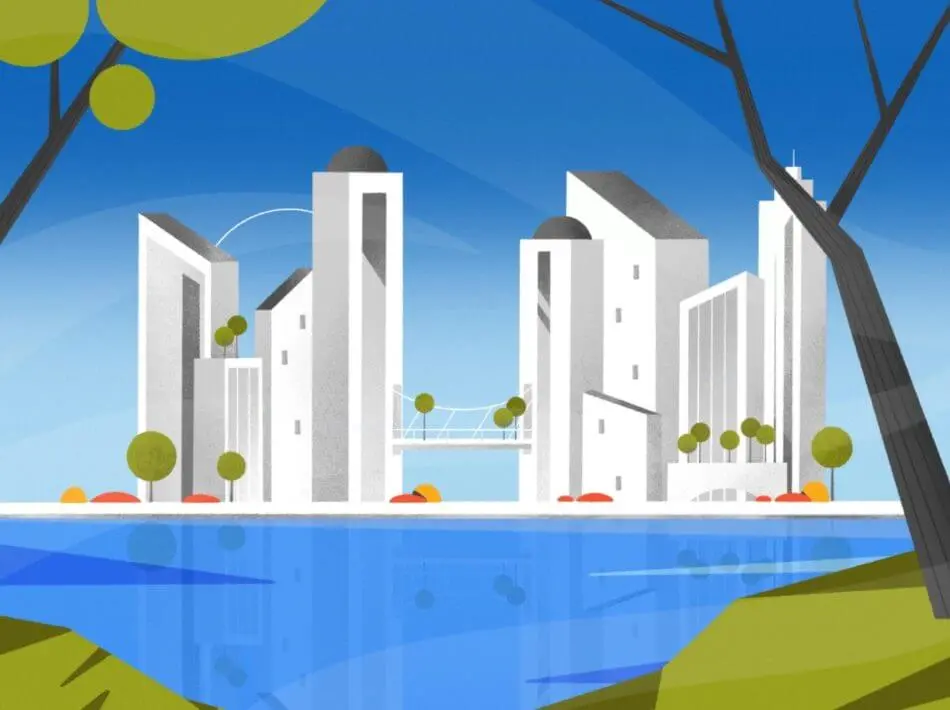
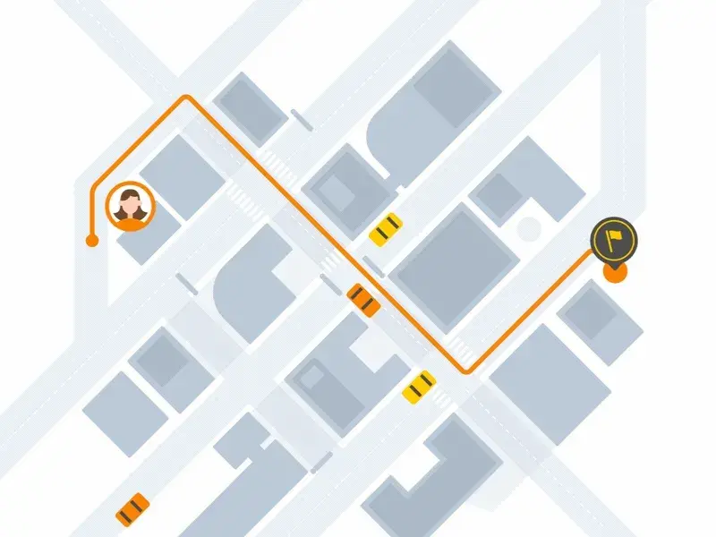
Earlier flat illustrations were literally everywhere. Google has developed massive material design guides and taught everyone how to simplify. Excessive detail has disappeared from the interfaces, and everything has become as straightforward as possible. But it’s already 2022, and it’s time to clean up the flat pictures before a new round of fashion. Instead, apply neomorphism. The volume and realism are achieved through shadows on a monophonic minimalistic background. There are accents, but not too many of them, so as not to overload the interface.
Instead, use professional illustrations:

Videos in the background
Every second site used to have a video in the background. No wonder they say the video adds dynamics and conveys the brand’s atmosphere. But there are many “buts” at once. Firstly, speed – video considerably slows down all the processes on the site. Secondly, boredom – if you make the video smaller, it repeats more often and quickly annoys the user. Thirdly, adaptability – video on mobile devices often does not load or is displayed incorrectly, etc.
Instead, apply incredible animated videos:
Horizontal scroll
Horizontal scrolling is a fantastic and unexpected solution, but it is not always evident in practice. Many users get lost in the transition to the next step and often just leave. There are, however, elements for which a horizontal scroll will be just right: for example, if this is a portfolio of a photographer or model.
A better scrolling option here:
Acid colors
Acid-neon colors are leaving us and are better to use for those who need really nonstandard color solutions. Bright colors scream to our brain: “Attention! or Danger!” It may distract from the information on the website, even if there is not much of it. And secondly, our brain has already been stressed over the past decades. That’s why bright colors are a trend but use it carefully.
Bright, but appealing:

Extreme minimalism
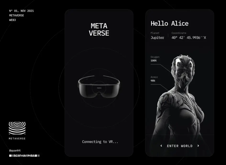
Finally, if minimalism is good, extreme minimalism is too much, and you definitely shouldn’t take it on your product plan. The user wants to know the details and like your product for quality content. If they don’t find something quickly with you – they will find it with someone else. So, it’s better to keep your product content.
Justified dark UX/UI minimalism here:

Conclusion
The UI/UX trends include multiple innovative technologies and trendy principles that developers use on their digital products to win the audience’s interest and attention. In 2022, interactivity, structure and brightness are considered relevant. Quite on the opposite, it’s better o avoid some anti-design trends like extreme minimalism overuse of acid colors and videos to improve your product UX/UI and gain users’ respect and loyalty.
Feel free with your anti-design trend ideas in the comments below. Contact us for help any time.


