13 Awesome Typography Trends for 2023
What you write is important, but how you write it can change everything. Typography is a powerful tool in a designer’s hands: use it right, and everyone will pay attention, use it wrong, and they’ll just scroll down. And while designing skills and that “feeling of what is right” make up a large share of a successful project, keeping up with trends is vital, like it or not. So in this guide, we’ll take a look at the latest trending fonts and typography styles — they’re already here, and they are definitely staying for 2023.
What Is Typography Exactly, And Why Is It Important?
Briefly, typography is how your text looks on the page/screen/wherever it is. It’s the art of arranging all the details — typeface, point size, line length, line spacing, and letter spacing — so that everything is clear, visually appealing, and conveys the mood you’d like it to convey.
And it’s not just about making everything look beautiful. Typography plays an important role or, actually, at least four important roles:
- Typography sets the tone and mood of the design. It conveys a message and evokes emotions, just like images and colors.
- Typography impacts readability and accessibility. Choosing the right font, size, and spacing can make the text easier to read and comprehend, especially for people with visual impairments or reading difficulties.
- Typography is an integral part of branding and visual identity. It can help create a recognizable and memorable look and feel for a company, product, or service.
- Typography improves the overall UX design. Clear, legible text can help guide the user through the content and make it easier to navigate and understand.
Cool typography can turn a good design project into a great one. Bad typography can turn an awesome design project into a horrible one. In a world where you’re fighting for each second of users’ attention, it’s not enough to just buy some trendy popular fonts and ram them on the screen. Designers should understand the latest typographic trends and know how to align them with their projects. And while the latter is on you, we can at least help you with the former.
Hot Typography Trends in 2023
With the global crisis peeking from around the corner, 2023 is not going to be the easiest year. So it’s no wonder that going old-school is a big typography trend — if digital design can, for a moment, bring you to happy childhood times with family, the designer did something right. But, of course, modern typography is not just about that. So let’s dive into all those creative font styles you’ll soon be seeing everywhere and the hottest typography trends for 2023.
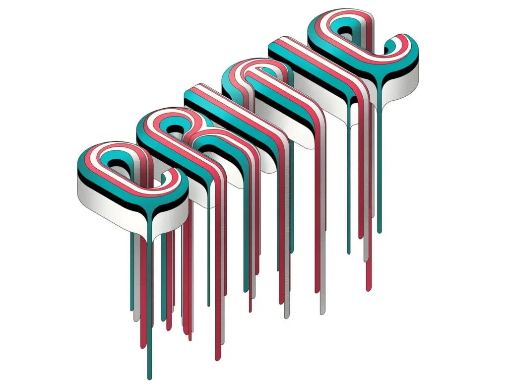
3D Typography
3D typography is not a new thing: it has been around since the 60s, but the rising popularity of virtual and augmented reality brings 3D typography a new life. We love it as it adds depth and dimension to the text, makes everything literally pop off the screen. 3D letters look awesome both in animated videos and on flat backgrounds, drawing attention without being “too much”. The best thing about 3D typography: there are no rules. With the basic skills and proper design software, you can turn any existing font into a 3D one — or go crazy and create one from scratch, blending the line between typography, design, and illustration.
Pixel Fonts
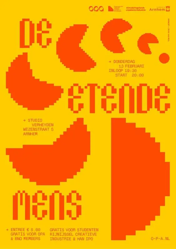
If there is anything we love more than 3D, it’s 2D. Pixel art came to us from the first 2D video games, so it’s no wonder the nostalgic wave brought it back. The retro, 8-bit aesthetic can give your design a playful and quirky tone — it might not be suitable for every project, but lots of web interfaces and other digital products can make use of a bit of the old-school atmosphere. With pixel fonts, you can evoke a sense of nostalgia and creativity, giving your audience a glimpse of the past while incorporating it into modern-day design.
Psychedelia
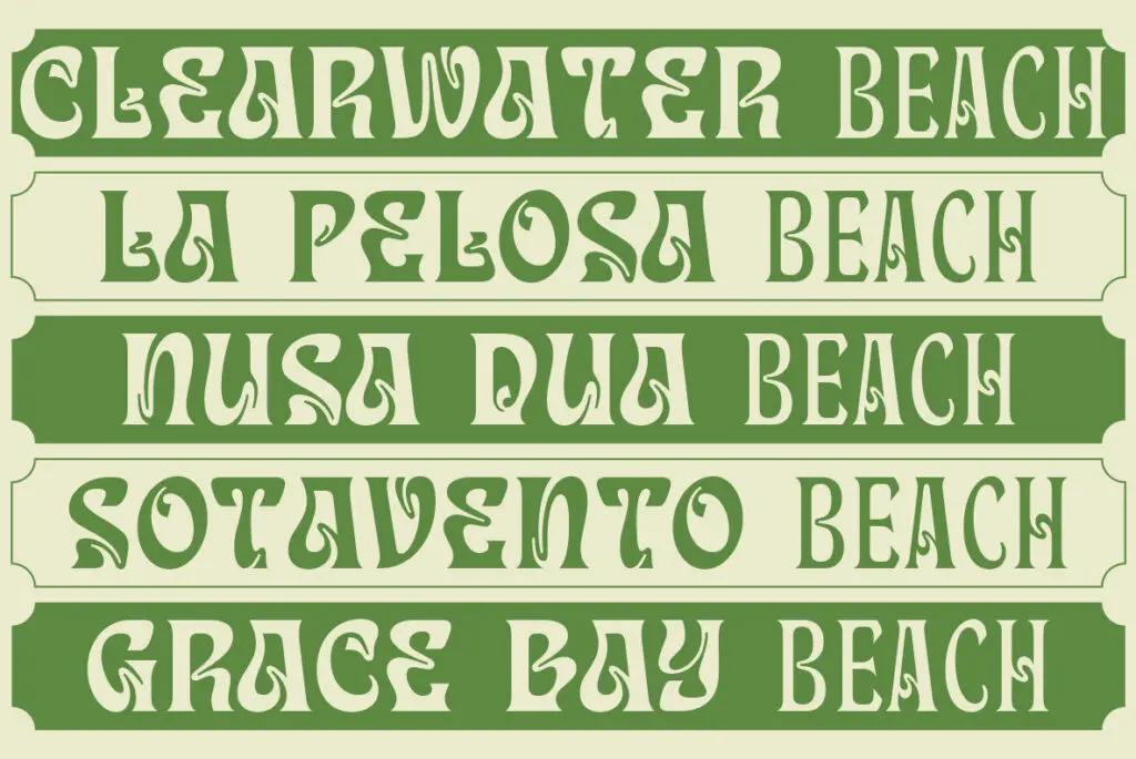
You can’t bring back the 70s without bringing back the psychedelia aesthetics. Influenced by hallucinogenic experiences, this style involves vivid and surreal artwork characterized by bold, bright colors, intricate patterns, and optical illusions. The artwork often features a kaleidoscopic effect, where the images would shift and blend together in a mesmerizing and otherworldly way. Now we bring it to the fonts, with the letters shifting and blending — not in the anxious glitchy way, but rather in a bright and soft one.
Distorted Fonts
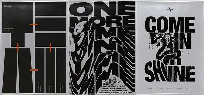
While psychedelic fonts can bring that “it’s all gonna be good” vibe to your design, give it a bit more distortion, and it can quickly go to “well, it actually might be bad”. Distorted fonts can create a moody atmosphere, and bring a sense of rebellion, chaos, or disruption, which can be effective for designs aimed at younger audiences or more edgy brands.
Distorted fonts can take many different forms. They may appear stretched, compressed, or skewed in different directions. They may also feature uneven letter shapes or uneven line weights. This style can be applied to both serif and sans-serif fonts, and the distortion can be subtle or extreme. So just pick yours and try to harness this trending typography — it might not be easy, but it will be worth it.
Italics
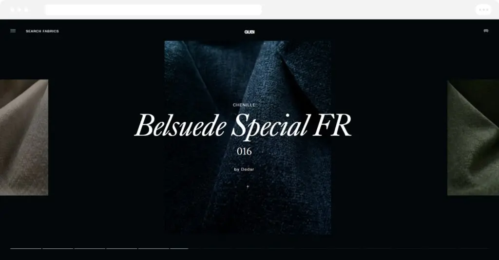
Well, it’s just italics, right? But in fact, italics in typography can help create a sense of motion, drama, or elegance, depending on the font used. Obviously, italicizing a word or phrase can add emphasis and highlight important information, which might come in handy when you need to fit a lot of text on the screen (although you’d better not).
Italics might sound boring. But try experimenting with varying degrees of slant or italicization, and you’ll get unique and innovative looks that add a playful or artistic twist to the design. Combine italicized fonts with contrasting weights or styles, such as bold or thin, and here it is — a visually striking effect that draws the eye.
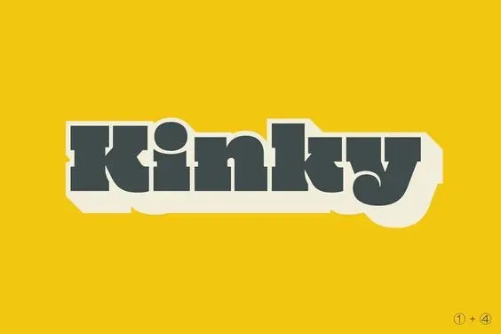
Slabs
At some point, designers started using less all-slabs typography as it seemed to “scream at users”. But it looks like today’s users don’t really mind being screamed at a bit, as slabs and all-caps typography are gaining popularity once again.
One of the slabs’ advantages is the ability to create contrast in a design. Pairing a slab serif font with a more delicate or refined typeface can create a dynamic tension that draws the viewer’s eye. Slab fonts can also be combined with other design elements, such as bold colors or geometric shapes, to create a visually striking composition. While they can be used to create a retro or vintage look, they can also be used to create a modern or edgy aesthetic, depending on the context.
Rounded Sans Serifs
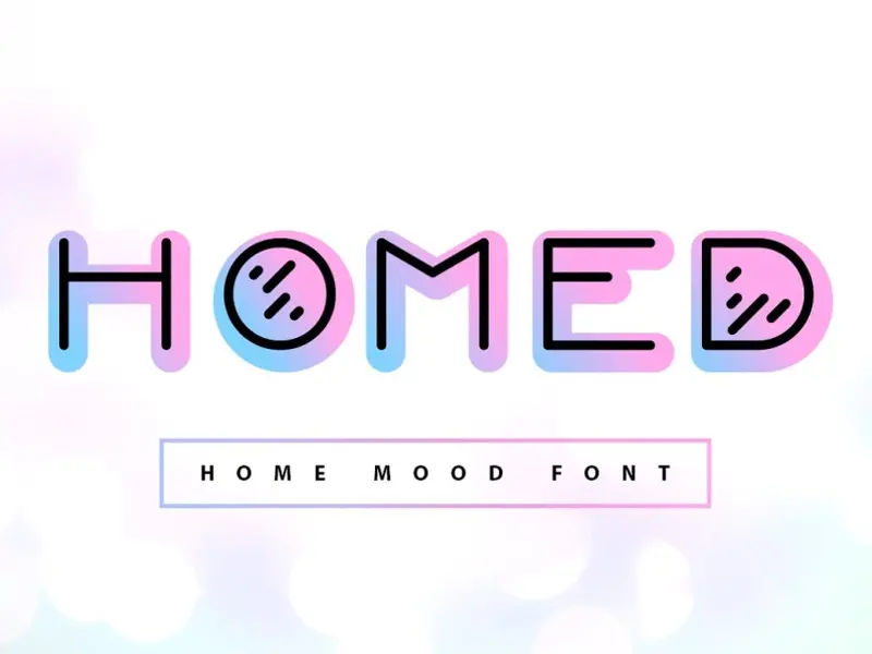
We’re so used to simple rounded sans that it might not look like a trend, but it’s actually a kind of popular font in 2023 you might want to take into account and try in your designs if you haven’t already. Rounded sans serifs give a friendly and approachable feel to a design and are often used to market products aimed at a younger or more casual audience. This trend is a departure from the sharp and edgy designs that have been popular in recent years and is a great choice for designs that require a warm and welcoming feel.
Handwriting Styles
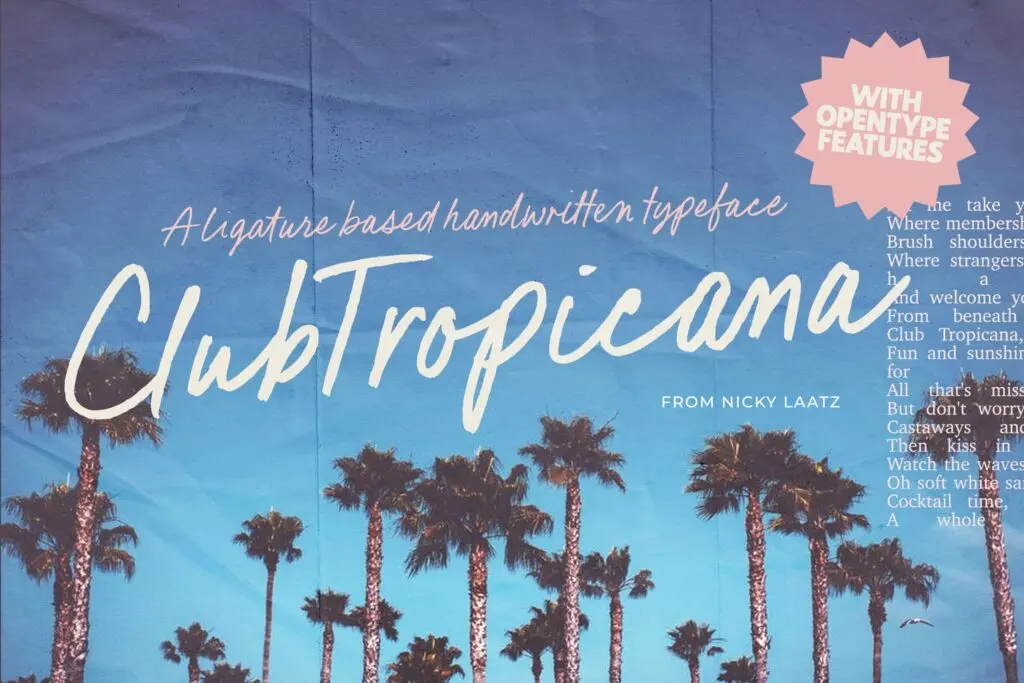
If you want a user to feel like they are looking at a letter from a friend every time they see your design, this trend might be just for you. This trend mimics the look of handwriting, with various script and cursive fonts that convey a sense of warmth, personality, and creativity. Exactly what you need to give a bit of a human touch to digital design.
This trend is popular in branding for businesses that value a personal and approachable image, such as boutique stores, restaurants, and cafes, but it doesn’t look less awesome in a website interface.
Paint It Red
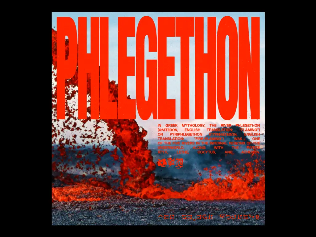
Enough with the form, let’s talk about color. If you’re a fan of solid-color fonts but rarely try something bolder than black or white, it might be time to go all-red in 2023. In recent years, the bright red trend has been seen in a wide range of design contexts, and it looks like this year, we will be seeing it everywhere.
With bold and vibrant shades of red, a graphic designer can make a statement and create a visual impact, draw attention to the important text, such as headlines or calls to action, or create a sense of urgency or excitement.
But be careful. While bright red can be an effective way to create a strong impact, it can also be overwhelming if used excessively or inappropriately. Make sure to strike a balance between the red and other design elements, such as imagery and negative space, to create a cohesive and visually appealing composition.
Liquid Chrome
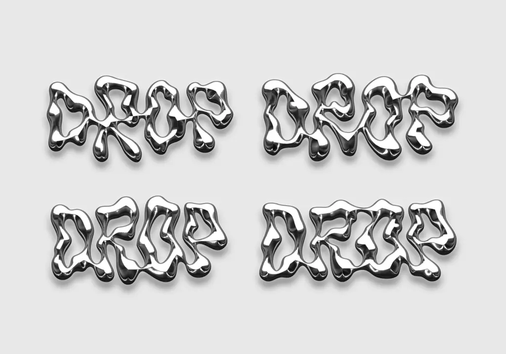
If simple rounded letters seem too boring, why not spill some liquid chrome on your designs? We’ve already talked about 3D fonts, but this trend takes them to a new level of fun and futurism. It is inspired by the reflective surfaces of high-tech materials, so it conveys a sense of modernity, sophistication, and luxury. Liquid chrome is a great choice for brands that want to create a bold and eye-catching look. Pairing it with other design elements, such as geometric shapes or abstract patterns, can create a cohesive and visually striking design.
While most liquid chrome-involving designs are created with bold and blocky fonts, the trend also looks awesome with thin and delicate ones.
Gradients in Text
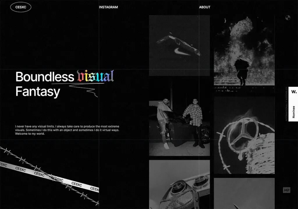
Gradients have been misused and overused a lot and now have a bit of a bad reputation. However, 2023 brings gradients in the text back to use — this time, a bit more subtle and intelligent use than in those PowerPoint presentations we did in high school. Typography gradients can be used in a variety of digital design contexts, including logos, headlines, and social media graphics. This trend is also particularly effective for designs that require a vibrant and eye-catching look, such as advertisements, posters, and branding materials. Don’t let it get cliche: experiment with different color combinations and gradient styles to create a unique and attention-grabbing design, and you’ll win this trend.
Left Alignment
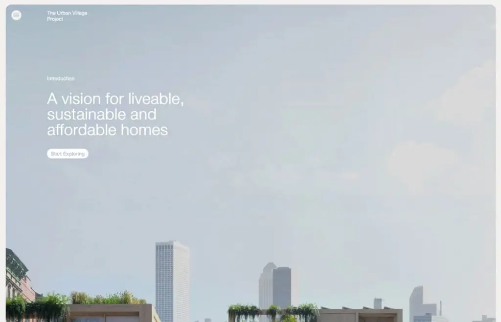
We’ve talked about form, we’ve talked about color, and now let’s talk about where your text should be located in 2023. And as you could have guessed from the heading — yes, this year we align it to the left, just like Beyonce told us.
Left-aligned text creates a sense of order and structure, which can help to guide the reader’s eye through the content. It is particularly effective for longer blocks of text, such as in editorial layouts, because it creates a clear and easy-to-read hierarchy of information. Left alignment can also create a sense of visual interest, particularly when combined with other design elements such as white space or asymmetrical layouts. Overall, it’s a nice and super-easy way to achieve a clean and modern look in design while perfectly structuring all the info on the screen.
Move Beyond The Screen
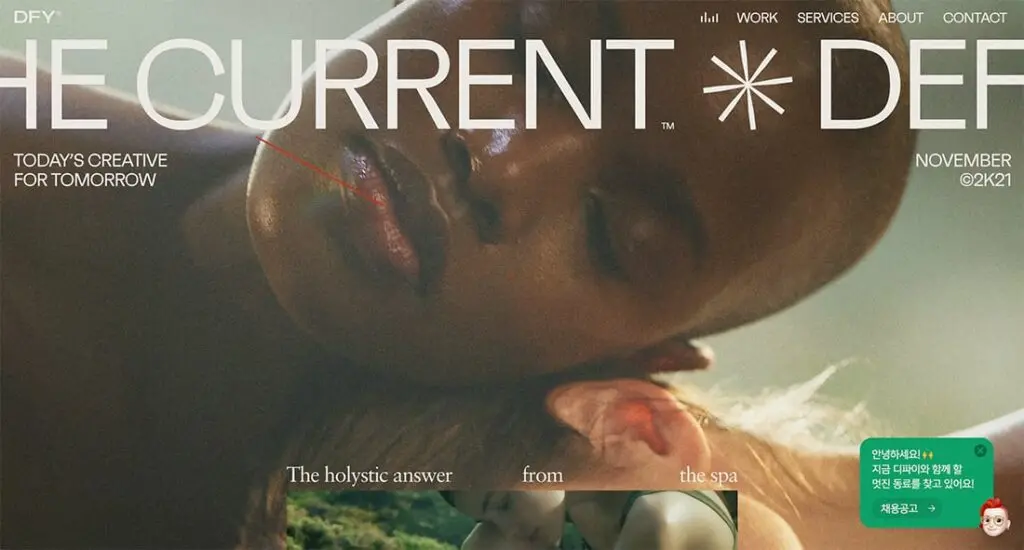
The “text that goes off the screen” trend is a bold and daring typography choice that adds an extra level of intrigue to a design. It involves extending the text beyond the boundaries of the layout, creating a sense of depth and movement.
When executed properly, it can create a feeling of anticipation and excitement, as the viewer is left wondering what lies beyond the edge of the screen or page. This technique can be used to draw attention to certain words or phrases and can be combined with other design elements, such as images or illustrations, to create a cohesive and impactful composition. However, it’s important to use this trend sparingly and thoughtfully, as using too much or too often can quickly become overwhelming or distracting — or just don’t let your viewers read the words they need.
Conclusion
Typography is an essential aspect of any design project, it’s a fact. The way text is presented can impact the overall effectiveness and aesthetic appeal of the design. And as you have seen in our selection of popular typography styles and trendy fonts in 2023, things are constantly changing and evolving — so designers must stay up-to-date.
But while it’s important to keep up with current trends, designers should also remember that good typography is about more than just aesthetics. Follow the trends, but always consider the legibility, readability, and hierarchy of information in a design. A successful design is one that not only looks good but also communicates its message clearly and effectively.
Incorporating typography trends in your design requires balance and creativity. Experimenting with various font styles, sizes, and arrangements can produce unique and innovative styles that stand out from the crowd — but overdo it, and everything will go wrong.
In 2023, the typography trends we outlined are sure to make their mark in the design world. Whether it’s liquid chrome, bright bold red, kinetic typography, or humble rounded sans, these styles can help you elevate your designs and communicate the brands’ messages in a more engaging and memorable way. Website designs, mobile apps, or animated explainer videos — every modern digital product can make use of the latest typography trends as long as the design magic is performed by a skilled expert.
