20 Kinetic Typography Examples
Marketers are constantly looking to present a new product, event, or idea of their company in an out-of-the-box way. They understand that they need to somehow stand out in the market to attract attention. The marketing department strives to make viral campaigns and constantly looks for the best options, analyzing trends and competitors from its field and others.
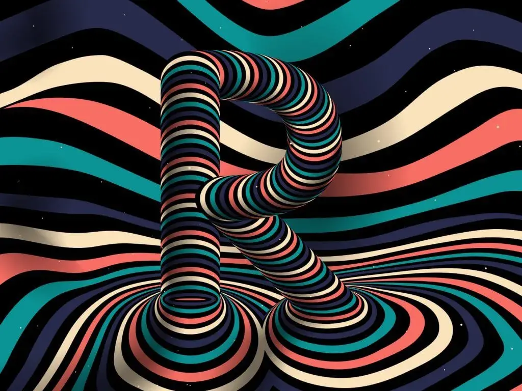
We’re going to introduce you to kinetic typography animation, which can help you promote and increase your brand’s influence. In addition, you will learn about the different types of this animation. Perhaps exciting kinetic text examples will inspire you to create your advertising masterpiece.

What is Kinetic Typography?
Kinetic typography is about how to create your own animation technique that combines text and movement (typographical video). It conveys ideas and evokes emotions in people. Kinetic animation helps to create an unforgettable effect on viewers, who can be both your current clients and potential ones. In addition, typographic animation has the following advantages:
- High-quality animation is easier and faster to create than high-quality video on camera. You don’t need actors, location, and expensive equipment for animation typography
- Your graphic designer/artist can use different styles and techniques
- Editing animations is much easier. You do not need to collect actors, select locations, and think about equipment again
Next, we will show you 20 kinetic type kinetic videos examples from different industries.
1. McDonald’s
McDonald’s made this promotional kinetic videos during the COVID-19 pandemic to show they continue to take orders from their customers at the Drive Thru. The company has used corporate colors that evoke associations with its brand. Also, the animation looks pretty cute when combined with a nice and simple soundtrack.
2. Apple
Apple advertising has always been something special. Just remember how millions of people worldwide are expecting a new presentation from this company. In this commercial, you can see a combination of Kinetic Typography, 3D computer graphics, and camera shooting. In addition, the visuals are perfectly complemented by dynamic music, which heats the presentation of new Apple products.
3. Catch Me If You Can
You may have already seen the movie “Catch Me If You Can” by Steven Spielberg. At the beginning of this work, he added what was essentially a short film for three minutes, where you will find out who worked on the big film. We recommend that you pay attention to detail in this kinetic typography video so you can see hints of the plot.
The simple line drawing that runs through the sequence has been cleverly modified to match the actors’ names with the props from the story. Moreover, such a bright start to the film helps grab the audience’s attention and push the story to the end. We’ll skip the spoiler because the movie is pretty darn good.
4. Rick and Morty
Animator and director Gary Motion created this video based on Rick and Morty’s TV show. He used colors that are associated with the protagonists: yellow and blue. Notice how smoothly the phrases change in this video. In addition, the animator used visuals to help viewers feel Morty’s concern and Rick’s scientific determination.
5. Spider-Man
The viewer can see a cobweb in which letters appear and disappear effectively. In addition, the creators also added incredible music here, which brings the viewer to the beginning of a captivating superhero story. Almost 20 years later, this film is still quite popular.
6. The Office
We are sure you will enjoy this kinetic type animation example. Why? You see a snippet of dialogue from the sitcom television series “The Office”, where each phrase and picture, one after another, flows into the following elements. In addition, we noticed that when an actor focuses on a word, this word is spelled caps in the video. And at the end of the video, you see the whole picture of the designer’s elements.
7. Fight Club
Most likely, you know the cult movie “Fight Club”. In this video, the main character talks about the rules of the fight club, and the creators of this video tried to make a monolog in a fun way. Also, you can see mostly black and red colors here. Why? Because the film itself is in dark colors. Accordingly, the author of the animation tried to recreate the original film’s style so that you and I could feel every word spoken by the hero. And do not forget about the red color, which is associated with blood. And at the end of the video, you will see a hint of the essence of the story’s plot.
8. From Paper to Screen
This outstanding video created by Thibault de Fournas shows how typography has changed traveling from paper to screen, from ancient techniques to modern cinematic technologies. This is a great example of kinetic motion graphics accompanied by an instrumental soundtrack and stunning visual effects.
9. Acomos
Acomos has created a nice video with minimalism in colors, words, and other elements. The graphic designers here have made good use of a dynamic line that turns words into moving icons along the way. The music in the background is calm and doesn’t distract from advertising.
10. Google
Five years ago, Google released a promotional video featuring its Google Home product. The video creators used kinetic typography to describe the functionality of this device. Google also added some unusual music here that complements the visual well.
11. Adele — Skyfall
Here is a video with the song “Skyfall”, in which the speed of appearance and disappearance of words depends on the voice of Adele. At the beginning of the video, you can see the famous gun barrel sequence (James Bond), which instantly piques the audience’s interest. Why? Most people have seen at least one movie from this franchise. While the kinetic typography may not be the brightest here, the music complements it well.
12. Rolling Stones — Doom and Gloom
Trunk Animation created a video for the song The Rolling Stones. This song Doom and Gloom appeared on the occasion of the 50th anniversary of the group. The company came up with breathtaking splash-style animations. If you look closely, the visual is similar to the typographic art of Ralph Steadman. In addition, you can find another similar video for the song Paint It, Black.
13. Coldplay — Atlas
New York-based agency Blind Pig partnered with creative agency Hugo & Marie to create this beautiful video using kinetic typography motion graphics. Illustrations are based on the sky map and myths by Mika Liedberg. The video is a continuous animation sequence with Coldplay music.
14. The Score — Unstoppable
The Score has released a video featuring the inspiring song Unstoppable. The creators have perfectly combined dynamic text and visual elements. In addition, this video is even more than just a regular kinetic typography video, as it is a short film with a gripping storyline.
15. Eyemart Express
Eyemart Express used the kinetic type to show you three simple steps in the video to help you find the perfect shape for your glasses. The creators have demonstrated what to avoid when choosing. In addition to the text, you will also see fascinating illustrations here to make it easier to understand. Moreover, calm and cheerful music plays in the background, which forms a good combination of each element in the video.
16. The Light in the Dark
Eli Guillou has created a brilliant video to inspire every person who feels lost in the dark. Her video can help these individuals find the light in the dark to move forward. If you think that it’s not easy to surprise you, then this video will turn your idea of kinetic typography upside down. Text, voice acting, music, effects, and transitions are perfectly combined. We’re confident this video can inspire you to create exciting kinetic typography ideas for your project.
17. Honda
Kinetic typography helps grab the viewer’s attention, exactly what Honda did. The company created a video that used this type of animation very effectively. Honda originally planned to use this video for a UK advertising campaign. But the video went viral, and marketers were actively using it worldwide.
Pay attention to the speed at which text appears and disappears in this video. It seems that it is impossible to have time to read everything, but you have time. You feel as if you have been sped up. In addition, Honda emphasized the challenge in the video, not the car.
18. The Things I Love
Dennis Hoogstad created a video where the audience is trying to guess what will happen next. You can see many elements in this video, but they are in harmony with each other and perfectly tell the intended story. Also, pay attention to music and sound effects.
19. Tomorrow I’ll be Brave (Jessica Hische)
Oddfellows created an animated video to bring the book’s pages to life in a hilarious short trailer for the new book. The designers here played very interestingly with the words used to create entire scenes.
20. First Step (Childline)
The creators of this video figured out how to show children’s thoughts and emotions using kinetic typography. Notice how some of the words blur at first and then become clear. This video helps parents understand how their children might feel.
Wrap Up
So, as you now know, kinetic typography is a powerful tool for creating immersive videos in different directions. Companies create commercials; music groups create music videos; designers develop social videos and book trailers, and much more. They help to convey the message of different brands to viewers.
Specialists are increasingly paying attention to this type of video because it is beneficial for money and time. Above, you have seen various kinetic typography examples from 3D animation companies that can help you figure out what you would like to create. Perhaps your video will become viral and even receive an award.
Do You Want to Create Your Video? – Feel Free to Contact Us!
Video creation is a complex process that requires experienced professionals who can do everything from the storyboard to the final product, even when it comes to a short 1 minute explainer video.
We at Explain Ninja provide animated video production services and know the best kinetic typography technologies for making our works and typography examples in advertising. In addition, our team can also help you select an idea.
Contact us, and we will tell you about explainer video pricing and help you create an animated video for your business.


